 Beta
BetaThe frontend framework for correctness.
Built on Effect. Architected like Elm. Written in TypeScript.
npx create-foldkit-app@latest
Declare behavior. Ship. Repeat.
React, Vue, Svelte, and Solid solve rendering and leave the architecture to you. Foldkit gives you the architecture, so you can focus on your domain.
Predictable state
One immutable model holds your entire application state. Every change flows through a single update function. No hidden mutations, no stale closures, no surprises.
Explicit effects
Side effects are values you return from update, not imperative calls buried in handlers. Commands describe what should happen. The runtime handles when and how.
Scales with grace
Complexity grows linearly, not exponentially. A 50-file app follows the same patterns as a 5-file app, so each feature adds structure instead of entangling with what is already there. New team members read the code and understand it.
Built on Effect. Inside and out.
If you already know Effect, Foldkit feels natural. If you’re new to Effect, Foldkit is a great way to learn it.
- Every Foldkit application is an Effect
- All state is a single Schema
- Side effects are modeled as Effects that never fail
See it work.
Watch a message flow through update into the model. The code highlights in real time to show you what’s happening at each step.
Batteries included.
Most frameworks ask you to bring your own routing library, state manager, UI kit, and form validator. Foldkit ships them as one coherent system.
Routing
Type-safe bidirectional routing. URLs parse into typed routes and routes build back into URLs. No string matching, no mismatches between parsing and building.
Explore routingUI Components
Accessible components (dialog, menu, tabs, listbox, disclosure, and more) built for The Elm Architecture. Easy to style and customize.
Browse the componentsSubmodels
A self-contained Model, Messages, update, and view, embedded inside a larger program. Children surface domain facts as typed OutMessages and parents handle them in update. Every stateful Foldkit UI component ships as a Submodel.
Explore SubmodelsSubscriptions
Bind a slice of the Model to a scoped Stream that may emit Messages. The runtime opens the scope while the slice holds its value and closes it when the slice changes.
Explore SubscriptionsManaged Resources
Model-driven lifecycles for long-lived browser resources like WebSockets, AudioContext, and RTCPeerConnection. The runtime acquires when the Model calls for the resource and releases when it no longer does.
Explore Managed ResourcesField Validation
Per-field validation with sync and async support. Define rules as predicates, apply them in update, and the Model tracks every field state.
Explore field validationTesting
Two test primitives. Story sends Messages through update and asserts on the resulting Model and Commands. Scene drives the rendered view through accessible locators and asserts on the re-rendered HTML.
Explore testingDevTools
Inspect Messages, Model state, and Commands as your app runs. Time-travel mode rewinds your UI to any past Model. AI agents can connect to the same data over MCP.
Explore DevToolsEmbedding
Run a Foldkit widget inside any host application with Runtime.embed. The host pushes data in and receives values out through Schema-typed Ports, and tears the widget down with dispose.
Explore embeddingTests that read like stories and scenes.
Pure update functions mean pure tests. Story tests the state machine. Scene tests features through the view (clicking buttons, typing into inputs) with accessible locators. No DOM, no mocking.
Learn about testingimport { Scene, Story } from 'foldkit'
import { expect, test } from 'vitest'
// Story — test the state machine
test('fetch weather updates the model', () => {
Story.story(
update,
Story.with(model),
Story.message(SubmittedWeatherForm()),
Story.model(model => {
expect(model.weather._tag).toBe('WeatherLoading')
}),
Story.Command.expectExact(FetchWeather),
Story.Command.resolve(FetchWeather, SucceededFetchWeather({ weather })),
Story.model(model => {
expect(model.weather._tag).toBe('WeatherSuccess')
}),
)
})
// Scene — test through the view
test('type a zip code, click get weather, see the forecast', () => {
Scene.scene(
{ update, view },
Scene.with(model),
Scene.type(Scene.label('Zip code'), '90210'),
Scene.click(Scene.role('button', { name: 'Get Weather' })),
Scene.expect(Scene.role('button', { name: 'Loading...' })).toExist(),
Scene.Command.expectExact(FetchWeather),
Scene.Command.resolve(FetchWeather, SucceededFetchWeather({ weather })),
Scene.inside(
Scene.role('article'),
Scene.expect(Scene.text('Beverly Hills, California')).toExist(),
Scene.expect(Scene.text('72°F')).toExist(),
),
)
})Watch your program think.
When every state change flows through Messages and a single Model, you get DevTools that would be impossible in a mutable-state framework. Every Message is logged. Every Model state is inspectable. Click any row to see exactly what changed.
Plus, AI agents can connect over MCP. They read the current Model, walk Message history, and rewind the UI to past states. Programmatic access to the same data DevTools shows you.
This site runs on Foldkit. Look for the tab on the bottom right of this page to try DevTools live.
Learn about DevTools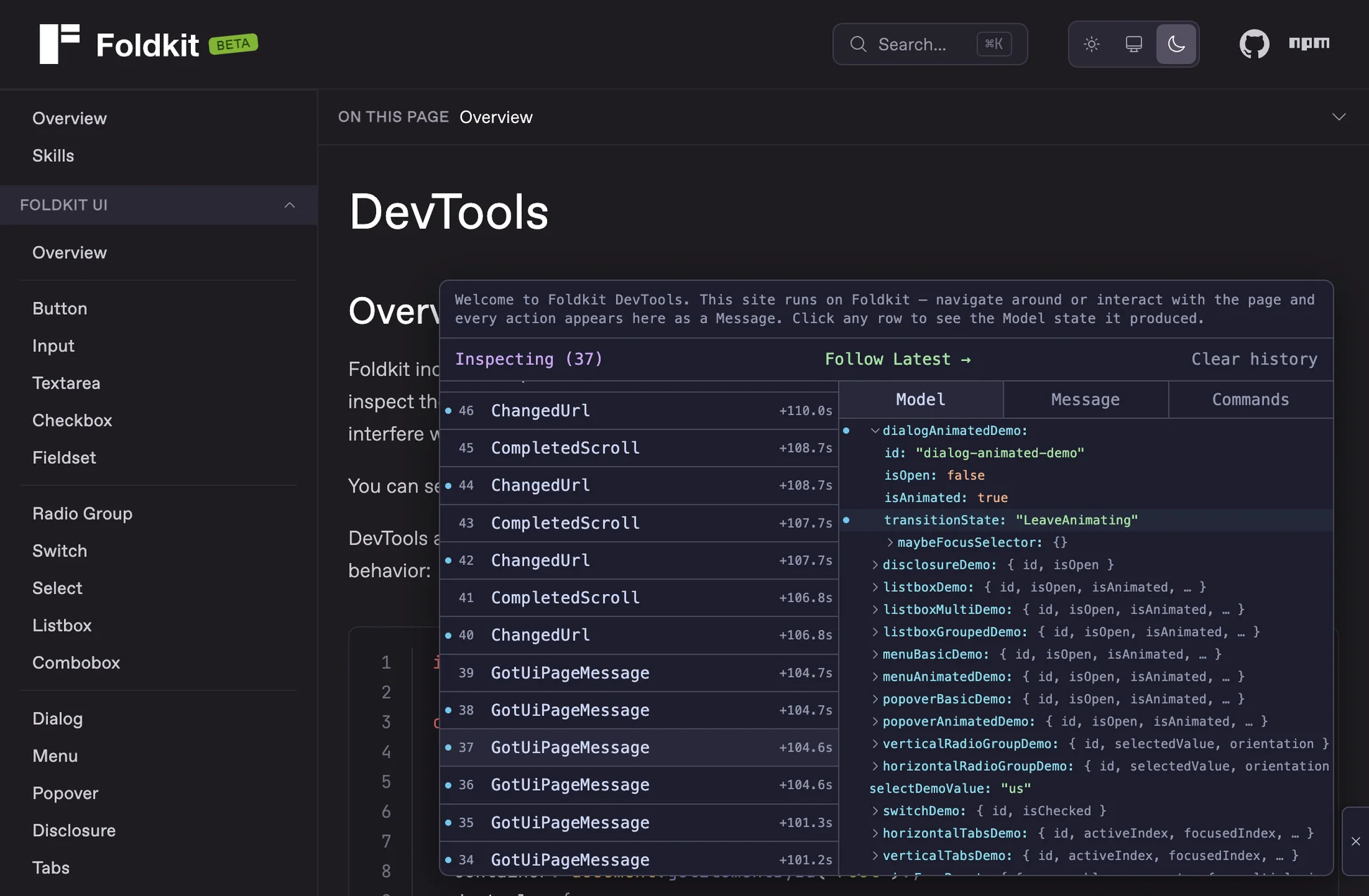
Built for
b.
Foldkit apps are explicit and predictable. This makes LLMs particularly good at generating Foldkit code. And it makes generated Foldkit code exceptionally easy for humans to review.
AI agents can also connect directly to a running Foldkit app over the Model Context Protocol. They read the current Model, inspect Message history, rewind the UI to past states, and dispatch Messages.
Set up AI-assisted developmentWhat’s the catch?
Foldkit asks you to think about frontend development differently. It uses The Elm Architecture, so there are no components, no hooks, no local state. Everything is declarative and structured. You’ll need to shift how you think about state, effects, and views.
It’s a discipline. It pays off, but it’s a real ask.
See how it worksHow does it compare?
Foldkit is a different kind of frontend framework. If you’re weighing it against React, Vue, Svelte, or Solid, the key difference isn’t syntax or performance. It’s that Foldkit prescribes the architecture instead of leaving it to you.
Compare to ReactWho it’s for
Effect developers who need a frontend
Your backend already uses Effect. Foldkit is the missing frontend piece: same ecosystem, same patterns, no context switching.
Developers who value correctness
You want your architecture to prevent bugs, not just catch them.
Teams that need to stay aligned
One pattern for state, effects, and views means less disagreement and faster onboarding.
Projects with complex state
Auth flows, real-time data, multi-step forms. Each becomes explicit state and transitions, so the hard parts stay readable instead of hiding in effects and refs.
Who it’s not for
Large existing React codebases
Foldkit isn’t an incremental adoption. It’s a different architecture, and migrating means a rewrite. The middle path is embedding: Runtime.embed runs a Foldkit widget inside an existing app.
Teams not ready to invest in Effect
Foldkit leans on pipe, discriminated unions, and Effect throughout. There’s no escape hatch. You’re all in or you’re not.
Projects that need the React ecosystem
No React component libraries, no Next.js, no existing middleware. You’re building on different foundations.
Teams that need server-side rendering
Foldkit is a client-side SPA framework. Static generation is possible, but you’ll roll your own (like we do for this website).
Proof of life.
Version
v0.131.0
Example apps
31Production app
Typing TerminalChangelog
View releases